
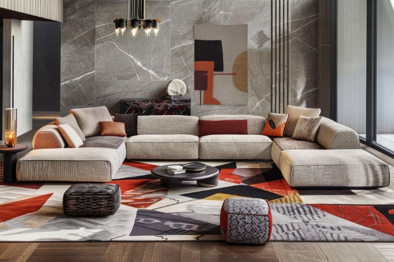
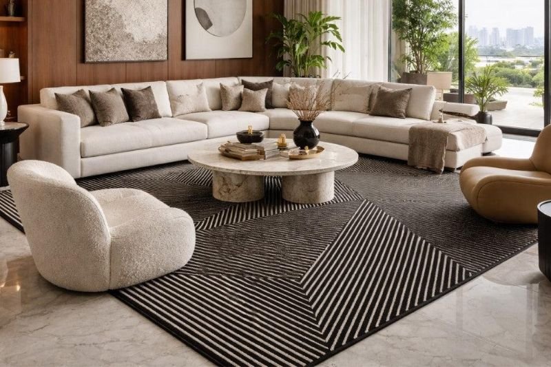
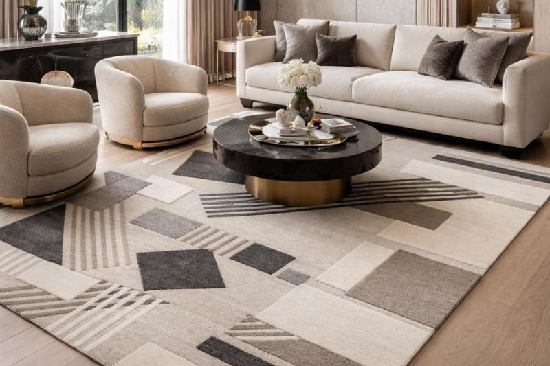
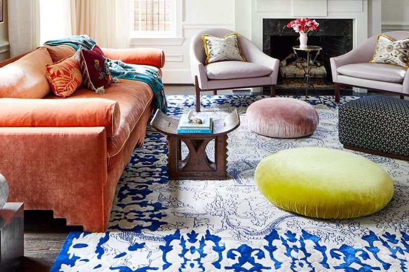
There is an old rule in interior design that refuses to disappear: your rug should match your sofa.
The colours should coordinate. The pattern should complement. The materials should feel consistent. Everything should appear as though it was chosen together, at the same time, from the same visual language.
It sounds safe.
But some of the most beautiful interiors in the world are beautiful precisely because they do not follow that rule.
A deep brown sofa can sit beautifully on a soft ivory rug. A sculptural boucle chair can be placed over a richly textured wool surface. A highly contemporary room can be grounded by a rug that feels almost vintage. A quiet, neutral interior can suddenly come alive because the rug introduces an unexpected colour, shape or texture.
The relationship is not about matching.
It is about creating a conversation between different elements.
And as luxury interiors become more personal, layered and expressive, designers are moving away from perfectly coordinated rooms towards spaces that feel collected, considered and individual.
The rug is no longer expected to disappear into the furniture.
Sometimes, it is meant to challenge it
The Problem With Making Everything Match
Matching has an obvious appeal. It creates order.
When the sofa, rug, cushions, curtains and chairs all share similar colours and patterns, a room can immediately feel organised. Nothing appears to compete with anything else.
But visual harmony and visual sameness are not the same thing.
A room needs contrast to create depth. Architecture itself teaches us this. A stone wall becomes more interesting beside warm timber. A polished surface feels richer when placed against something tactile. A soft textile becomes more noticeable when surrounded by harder materials.
Interiors work in much the same way.
When every element has the same visual character, the eye has fewer reasons to move around the room. There is little tension, little surprise and often very little personality.
A rug can change that.
It can introduce warmth into a cool interior, softness beneath hard architectural surfaces or movement into a room dominated by straight lines. It can create a visual pause between pieces of furniture or provide a contrasting foundation that makes everything above it feel more intentional.
The objective is not to make every element agree.
It is to make every element contribute
Your Rug Should Coordinate, Not Copy
There is an important difference between contrast and conflict.
A rug that clashes with an interior feels accidental. A rug that contrasts with it feels intentional.
The difference is often found in the details.
A rug may not share the exact colour of the sofa, but it might contain a subtle tone that relates to the timber of the coffee table. It may introduce a warmer version of a colour already present in the artwork. It may echo the texture of natural stone or balance the smoothness of leather upholstery.
The connection does not always have to be obvious.
In fact, the most sophisticated relationships are often the ones you feel before you consciously notice them.
Instead of asking, “Does this rug match my sofa?”, it is more useful to ask, “What relationship does this rug have with the rest of the room?”
That small change in perspective can completely transform the way a rug is selected
Colour Does Not Have to Match Exactly
One of the most common misconceptions in rug selection is that colours need to be identical to work together.
They don’t.
A warm beige sofa does not necessarily need a beige rug. It could work beautifully with ivory, tobacco, terracotta, muted brown or even a carefully considered deeper tone. A charcoal sofa does not require a charcoal floor. It might become more interesting against warm neutrals, earthy tones or a rug with subtle tonal variation.
The important thing is not whether two colours are exactly the same. It is whether they understand each other.
Designers often create this relationship through undertones, temperature and balance. A warm neutral can connect different materials throughout a room without becoming visually repetitive. A muted colour can pick up a secondary tone from artwork or accessories without looking deliberately coordinated.
This is particularly important in luxury interiors, where colour is rarely as simple as choosing one shade from a chart.
The difference between a cool beige and a warm beige can change the entire atmosphere of a room. So can the difference between a flat neutral surface and one that contains subtle variations created by fibre, pile, weaving or carving.
Matching is about sameness.
Coordination is about relationships.
Sometimes Texture Matters More Than Colour
There are rooms where the most beautiful contrast has almost nothing to do with colour.
It comes from texture.
Imagine a smooth leather sofa placed over a deeply tactile rug. Or a crisp linen sectional grounded by a softly irregular wool surface. A sculptural boucle chair can become even more expressive when positioned against a flatter, more graphic rug.
The colours might be relatively quiet.
The textures create the conversation.
This is especially relevant to contemporary luxury interiors, where colour palettes are often restrained. When a room relies on warm whites, taupes, browns and natural tones, materiality becomes incredibly important.
Stone, timber, plaster, metal, leather, linen and wool each respond differently to light and touch.
The rug becomes another material within this composition rather than simply a coloured object placed beneath the furniture.
It introduces softness into hard architecture. It can bring warmth beneath stone, contribute to acoustic comfort and create another layer of visual depth.
In a restrained room, that depth can be what makes the difference between something that feels merely minimal and something that feels genuinely luxurious.
Let the Rug Be the Unexpected Element
Not every room needs a quiet rug.
Sometimes the architecture and furniture are restrained enough to allow the floor to become the expressive element.
Consider a room with neutral walls, clean architectural lines, natural stone, simple upholstery and minimal furniture. A neutral rug would maintain the calmness of the space. But a rug with a stronger pattern, sculptural surface, unusual shape or unexpected colour could give the room a completely different identity.
That does not mean the rug needs to be loud.
A statement does not necessarily mean bright.
A tonal abstract design can create as much visual interest as a highly saturated pattern. A carved surface can create drama through light and shadow. An irregular silhouette can interrupt the geometry of an otherwise rectilinear room.
Sometimes, the strongest statement is simply something that is different enough to be noticed.
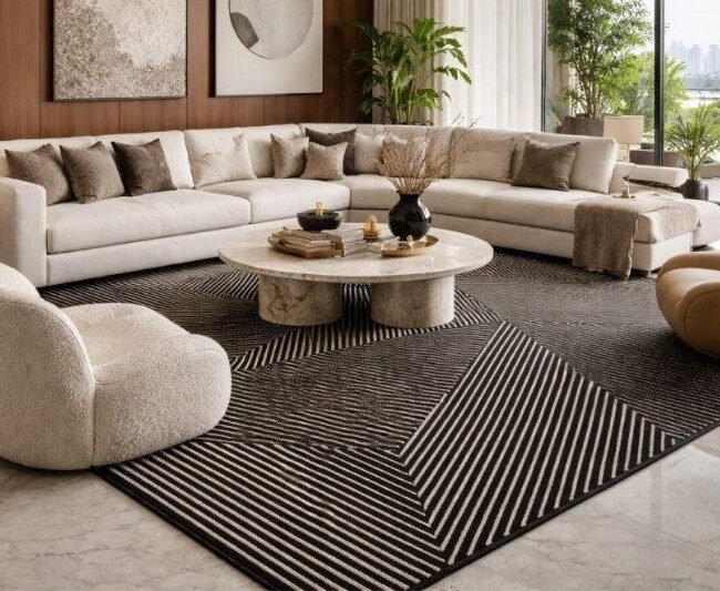
Proportion Matters More Than Matching
There is another reason a rug can feel wrong even when its colour matches the sofa perfectly.
It may simply be the wrong size.
A beautifully coordinated rug that is too small can make furniture appear disconnected. The seating arrangement can lose its sense of unity, and the entire room can begin to feel visually fragmented.
A well-proportioned rug, on the other hand, can bring a room together even when its colour is completely different from the furniture.
This is because rugs do much more than decorate a floor.
They establish visual boundaries. They anchor furniture. They define zones. They influence how objects relate to one another.
This becomes particularly important in open-plan interiors, where a rug can create an invisible room within a larger architectural space. It can distinguish a living area from a dining space or give a conversation zone its own sense of identity without requiring walls.
In such spaces, proportion and placement can matter far more than colour matching.
The right rug does not simply sit beneath furniture.
It gives the furniture somewhere to belong.
Why Designers Sometimes Start With the Rug
There is a reason experienced designers do not always treat rugs as the final layer of an interior.
A rug can establish the direction of an entire room.
Its colours can influence upholstery. Its texture can determine how other materials are balanced. Its proportions can guide furniture placement. Its pattern can create a rhythm that is subtly echoed through artwork, lighting or architectural details.
This becomes even more powerful when the rug is bespoke.
Instead of choosing a finished product and trying to make it work within an existing interior, the rug can be developed as part of the space itself.
At Rugs & Riches, the design process begins by understanding the architecture and the way the space is intended to be experienced. Natural light, circulation, proportions, material finishes and the emotional atmosphere of the interior are considered before fibres, colours, textures and construction techniques are selected.
This approach changes the role of the rug.
It is no longer something added after the important decisions have already been made.
It becomes one of those decisions.
Contrast Creates Personality
There is something else perfectly coordinated interiors can sometimes lack: personality.
When every object is selected to match, a room can look polished but strangely anonymous. Contrast introduces evidence of choice.
It tells us that someone made a decision.
Someone chose the unexpected rug. Someone allowed a contemporary piece to sit alongside something traditional. Someone decided that a strong geometric design could work within a softer room. Someone chose texture instead of another colour.
These decisions make a space feel considered rather than formulaic.
This is particularly relevant to the way luxury is evolving. Contemporary luxury is increasingly less about perfect coordination and more about authenticity, individuality and material richness. The most compelling interiors often combine restraint with contrast, allowing different periods, materials, textures and forms to exist together.
The result feels less like a showroom.
It feels lived in.
The Rise of the Collected Interior
Some of today’s most interesting interiors do not look as though everything was purchased at once.
They feel collected.
A contemporary sofa might sit beside a vintage chair. A sculptural table may stand on a rug with an older, more storied character. Modern artwork might share space with something inherited. Natural materials might exist alongside highly refined contemporary finishes.
The beauty comes from the relationship between these different elements.
The same principle applies to rugs.
A contemporary rug can give traditional furniture a fresh perspective. A vintage-inspired rug can bring warmth to a highly modern interior. A geometric design can add structure to a softer space. An organic shape can interrupt an architectural room and make it feel less rigid.
The rug becomes a bridge between different visual languages.
It does not need to look as though it belongs to the same collection as the sofa.
It simply needs to belong to the same story.
So What Should Your Rug Relate To?
If the rug does not have to match the sofa, what should you look at when choosing one?
Start with the architecture.
Look at the lines, proportions and character of the room. Are there strong horizontal elements? Curves? Arches? Large areas of stone? Timber details? The rug can echo these qualities or deliberately contrast them.
Then look at materials rather than simply colours.
A room filled with oak, travertine, linen and brushed metal already has a material story. The rug should add another layer to that story rather than simply repeating one of its colours.
Artwork can also provide a useful reference. Instead of matching the dominant colour of a painting, a rug might pick up a quieter secondary tone, creating a connection that feels much more sophisticated.
And then there is mood.
Should the room feel calm? Warm? Grounded? Dramatic? Soft? Contemporary? Collected?
The rug should contribute to that feeling.
Ultimately, the best rug is not necessarily the one that matches the most things.
It is the one that makes the entire room make more sense.
When Matching Actually Works
None of this means that matching is always wrong.
A tonal interior can be incredibly sophisticated. A monochromatic scheme can create a sense of calm and architectural clarity. A neutral sofa paired with a similarly neutral rug can produce a beautiful, understated environment.
The difference lies in intentionality.
If the sofa and rug are similar in colour, they can still be differentiated through texture, pile, pattern, scale or tonal variation.
A cream sofa and cream rug can be beautiful when the sofa is smooth and sculptural while the rug has a rich tactile surface. A neutral-on-neutral interior can feel incredibly luxurious when natural materials, lighting and proportions create enough depth.
Matching becomes limiting only when it is treated as a rule rather than a choice.
Designing Relationships, Not Matching Sets
The finest interiors rarely look as though every object came from the same catalogue.
They have layers.
They have contrast.
They have objects that feel new alongside things that feel timeless. They allow materials to age and different visual languages to coexist.
A rug can be one of the most powerful tools for creating that balance.
It can respond to architecture, challenge furniture, introduce texture, establish scale and create an emotional centre for a room.
This is especially relevant to bespoke rug design, where the dimensions, shape, colour and construction can be considered specifically for the space rather than selected from a predetermined range.
At Rugs & Riches, every bespoke rug begins with an understanding of the space, its architectural language and how it will be experienced. The intention is to create something that feels naturally connected to the interior rather than simply placed within it.
That is the difference between creating a matching set and creating a considered interior.
The New Rule: Let Your Rug Have Its Own Personality
A beautiful interior does not need every element to agree.
It needs every element to belong.
Your sofa can be quiet while your rug speaks. Your rug can remain neutral while the artwork takes centre stage. Your furniture can be contemporary while the rug introduces warmth and a sense of history. Or everything can be restrained, allowing texture and proportion to do the work.
There are no fixed rules.
And perhaps that is the most exciting part of designing with rugs today.
The rug does not exist simply to match the room.
It exists to complete the conversation.
So the next time you are choosing a rug, don’t ask:
“Does this match my sofa?”
Ask:
“What does this rug bring to the room that isn’t already there?”
Does it introduce texture? Does it create contrast? Does it ground the furniture? Does it soften the architecture? Does it bring warmth? Does it create movement? Does it make the room feel more personal?
If the answer is yes, it may be the right rug.
Even if it doesn’t match anything exactly.
About Rugs & Riches
For more than three decades, Rugs & Riches has collaborated with architects, interior designers, hospitality brands and discerning homeowners to create bespoke handcrafted rugs that respond to the unique character of each space.
Every rug is developed through a collaborative design process that considers architecture, lifestyle, materiality and atmosphere. By bringing together premium fibres, thoughtful design and generations of artisanal expertise, Rugs & Riches creates rugs that are designed not simply to complete interiors, but to become part of their identity.
At Rugs & Riches, we believe a rug should do more than match the room.
It should belong to it.
Frequently Asked Questions
Should a rug match the sofa?
No. A rug does not need to match the sofa exactly. It can instead create a relationship through complementary colours, contrasting textures, similar undertones, pattern, scale or material.
What should a rug coordinate with?
A rug can relate to the architecture, flooring, artwork, furniture, lighting and overall material palette of a room. The objective is to create visual balance rather than make every element identical.
Can a contrasting rug work in a neutral room?
Absolutely. A contrasting rug can introduce colour, pattern, texture or visual depth into a neutral interior. The contrast should feel intentional and connected to the wider design of the space.
Should the rug be lighter or darker than the sofa?
There is no universal rule. A lighter rug can create softness and openness, while a darker rug can add depth and grounding. The choice depends on the architecture, natural light, furniture, flooring and atmosphere of the room.
Can a patterned rug work with a patterned sofa?
Yes. Different patterns can work beautifully together when they vary in scale, visual weight or character while maintaining some connection through colour or tone.
Is rug texture important in luxury interiors?
Very much so. Texture can create depth even when a colour palette is restrained. Pile, fibre, carving and surface variation can all change how a rug interacts with light and the surrounding materials.
How do I choose the right rug for my interior?
Begin with the space rather than the sofa alone. Consider the architecture, proportions, natural light, flooring, materials, furniture arrangement and overall mood. From there, consider the rug’s size, shape, colour, texture and construction.
Can Rugs & Riches create a rug specifically for my interior?
Yes. Bespoke rug design allows dimensions, shape, colour, texture and construction to be developed specifically around a project. Rugs & Riches approaches each project by understanding the architecture, lifestyle and intended experience before moving into material and construction decisions.